Create Donut charts based on one or two columns in a data frame
plotSplitDonut(object, ...)

# S4 method for class 'GRanges'
plotSplitDonut(object, scale_by = c("n", "width"), ...)

# S4 method for class 'DataFrame'
plotSplitDonut(object, ...)

# S4 method for class 'data.frame'
plotSplitDonut(
  object,
  inner,
  outer,
  scale_by,
  scale_factor = 1000,
  r_centre = 0.5,
  r_inner = 1,
  r_outer = 1,
  total_glue = "{comma(N)}",
  total_size = 5,
  total_colour = "black",
  inner_glue = "{inner} {.data[[inner]]}\n{percent(p,0.1)}",
  outer_glue = "{outer} {.data[[outer]]}\n{percent(p,0.1)}",
  total_label = c("label", "text", "none"),
  inner_label = c("label", "text", "none"),
  outer_label = c("label", "text", "none"),
  label_alpha = 1,
  inner_label_alpha = NULL,
  outer_label_alpha = NULL,
  label_size = 3,
  inner_label_size = NULL,
  outer_label_size = NULL,
  label_colour = "black",
  inner_label_colour = NULL,
  outer_label_colour = NULL,
  min_p = 0.05,
  inner_min_p = NULL,
  outer_min_p = NULL,
  max_p = 1,
  inner_max_p = NULL,
  outer_max_p = NULL,
  inner_pattern = ".",
  outer_pattern = ".",
  inner_rotate = FALSE,
  outer_rotate = FALSE,
  explode_inner = NULL,
  explode_outer = NULL,
  explode_query = c("AND", "OR"),
  explode_x = 0,
  explode_y = 0,
  explode_r = 0,
  nudge_r = 0.5,
  inner_nudge_r = NULL,
  outer_nudge_r = NULL,
  expand = 0.1,
  inner_palette = NULL,
  outer_palette = NULL,
  inner_legend = TRUE,
  outer_legend = TRUE,
  outer_p_by = c("all", "inner"),
  layout = c(main = area(1, 1, 12, 12), lg1 = area(2, 12), lg2 = area(11, 12)),
  ...
)
Arguments
- object
A
GRangesordata.frame-like object- ...
Not used
- scale_by
Column to scale values by. If provided, values in this column will be summed, instead of simply counting entries. Any label in the centre of the plot will also reflect this difference
- inner
Column name to create the inner ring
- outer
Column name to create the outer ring, subset by the inner ring
- scale_factor
When scaling by another column, such as width, totals will be divided by this value, with 1000 being the default to provide output in kb.
- r_centre
The radius of the hole in the centre. Setting to zero will create a Pie chart
- r_inner, r_outer
The radii of the inner/outer rings
- total_glue
glue-syntax for formatting the total which appears in the centre of the plot. Internally, the value
Nwill be calculated and as such, this value should appear within this argument.- total_size
Label size total number of entries in the centre of the plot.
- total_colour
Label colour for the summary total in the centre
- inner_glue, outer_glue
glue-syntax for formatting labels which appear on each inner/outer segment Internally, the values
nandpwill be calculated as totals and proportions of the total. As such, these values can appear within this argument, as well as the fields described in the details- total_label, inner_label, outer_label
Can take values 'text', 'label' or 'none'. If setting one the first two values, the labelling function
geom_*will be called, otherwise no label will be drawn- label_alpha, inner_label_alpha, outer_label_alpha
transparency for labels
- label_size, inner_label_size, outer_label_size
Size of all text labels
- label_colour, inner_label_colour, outer_label_colour
Takes any colour specification, with the additional option of 'palette'. In this special case, the same palette as is used for each segment will be applied.
- min_p, inner_min_p, outer_min_p
only display labels for segments representing greater than this proportion of the total. If inner/outer values are specified, the values in
min_pwill be ignored for that layer- max_p, inner_max_p, outer_max_p
only display labels for segments representing less than this proportion of the total. If inner/outer values are specified, the values in
max_pwill be ignored for that layer- inner_pattern, outer_pattern
Regular expressions which are combined with max_p and min_p values for accurately choosing labels
- inner_rotate, outer_rotate
logical(1). Rotate labels for inner or outer rings. This will be ignored by when setting the geom as "label". See geom_text
- explode_inner, explode_outer
Regular expressions from either the inner or outer ring for which segments will be 'exploded'
- explode_query
Setting to AND and specifying values for both the inner and outer ring will require matches in both categories
- explode_x, explode_y
Numeric values for shifting exploded values
- explode_r
Radius expansion for exploded values
- nudge_r, inner_nudge_r, outer_nudge_r
Radius expansion for labels
- expand
Passed to expansion for both x and y axes. Can be helpful if labels are clipped by plot limits
- inner_palette
Colour palette for the inner ring
- outer_palette
Optional colour palette for the outer ring
- inner_legend, outer_legend
logical(1). Show legends for either layer
- outer_p_by
Scale the proportions for outer segments by the complete dataset, or within each inner segment
- layout
Passed to plot_layout
Value
A patchwork object consisting of both ggplot2 objects and legend grobs
Details
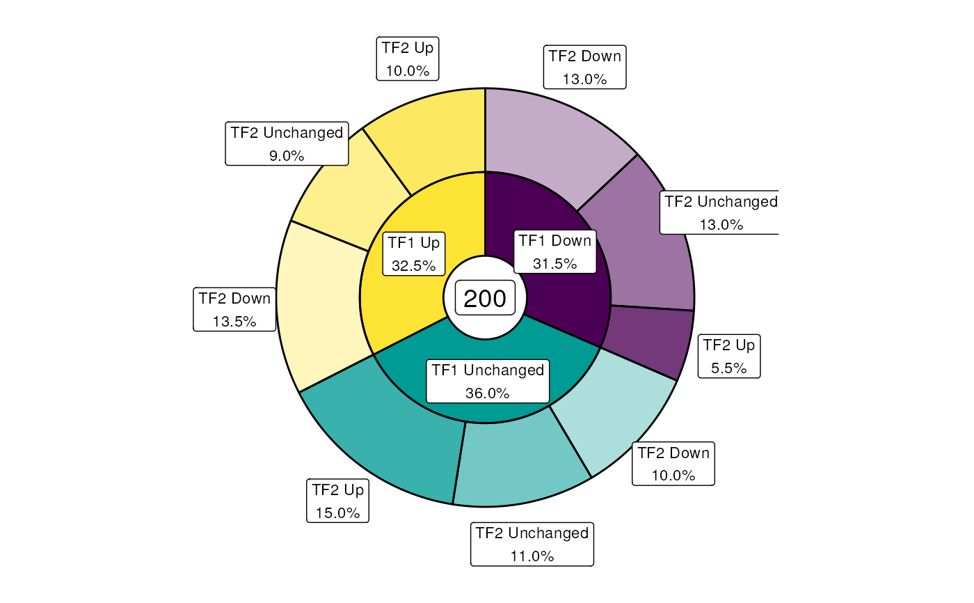
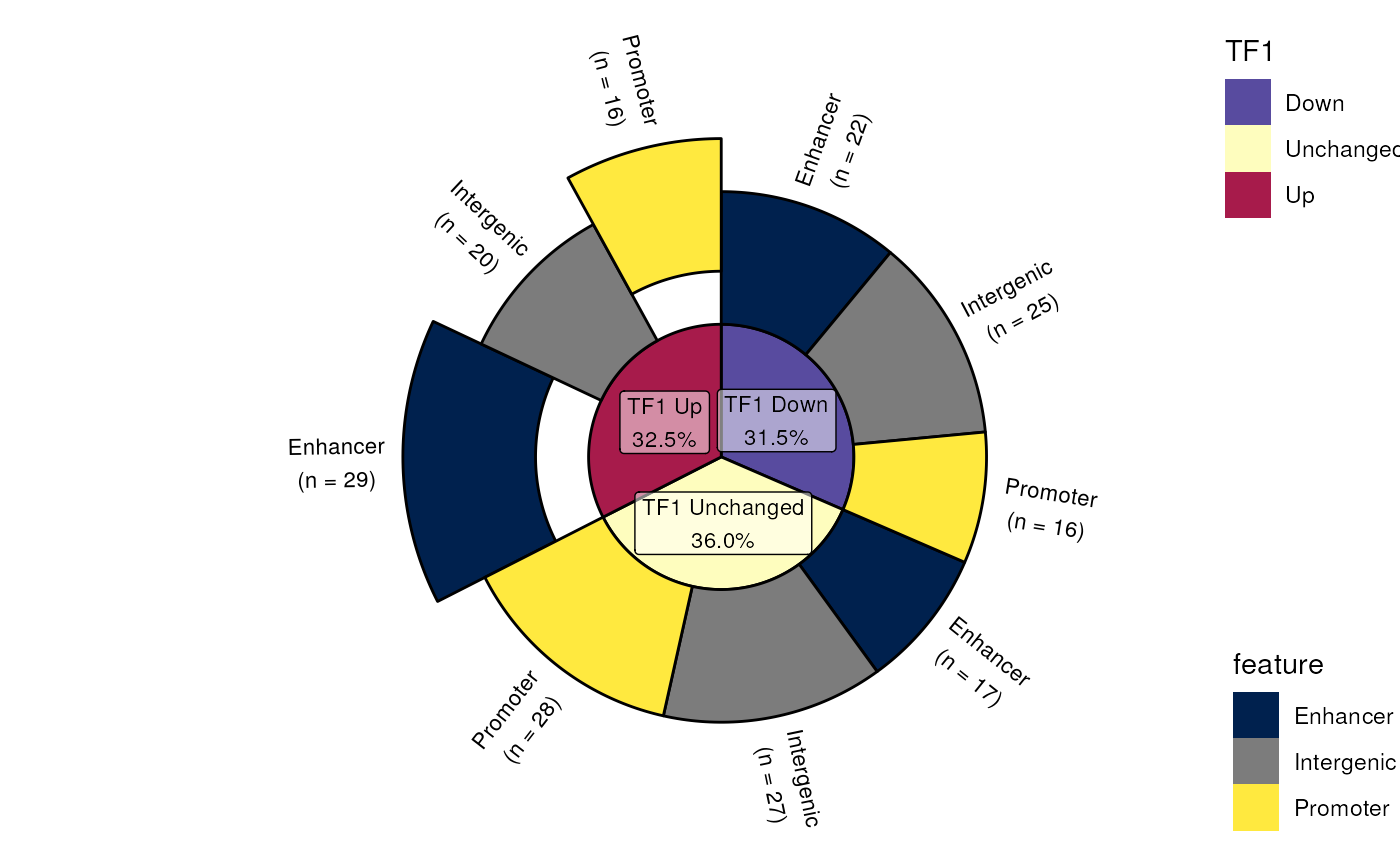
Using a data.frame or GRanges object, this function enables creation of a Pie/Donut chart with an inner and outer ring. The function itself is extremely flexible allowing for separate colour palettes in the inner and outer rings, as well as highly customisable labels.
Sections can be exploded using a value from the inner ring or outer ring
separately, or in combination by setting explode_query = "AND".
Exploded sections can be shifted by expanding the radius (explode_r), or
along the x/y co-ordinates using explode_x/y, allowing for detailed
placement of sections.
If only the inner palette is specified, segments in the outer ring will be assigned the same colours as the inner segments, but with increased transparency. Only a single legend will be drawn in this scenario. If an outer palette is specified, both colour palettes are completely distinct and two distinct legends will be drawn. The placement of these legends, along with the larger donut plot, can be manually specified by providing a layout as defined in plot_layout. Names are not required on this layout, but may be beneficial for code reproducibility.
The inner label denoting the total can also be heavily customised using the
glue syntax to present the calculated value N along with any
additional text, such as 'kb' if scaling GenomicRanges by width. The same
approach can be taken for the inner and outer labels, where totals are
held in the value n, proportions are held in the value p and the values
corresponding to each segment can be accessed using .data[[inner]] or
.data[[outer]]. Column titles can be added using {inner}/{outer}.
Values from the inner segments can be added to the outer
labels using this strategy enabling a wide variety of labelling approaches
to be utilised.
Examples
library(grDevices)
set.seed(200)
df <- data.frame(
  feature = sample(
    c("Promoter", "Enhancer", "Intergenic"), 200, replace = TRUE
  ),
  TF1 = sample(c("Up", "Down", "Unchanged"), 200, replace = TRUE),
  TF2 = sample(c("Up", "Down", "Unchanged"), 200, replace = TRUE)
)
## The standard plot
plotSplitDonut(df, inner = "TF1", outer = "TF2", inner_legend = FALSE)


## Adding an exploded section along with an outer palette & customisation
plotSplitDonut(
  df, inner = "TF1", outer = "feature", total_label = "none",
  inner_label_alpha = 0.5, r_centre = 0,
  outer_glue = "{.data[[outer]]}\n(n = {n})", outer_label = "text",
  explode_inner = "Up", explode_outer = "Prom|Enh",
  explode_query = "AND", explode_r = 0.4, outer_rotate = TRUE,
  inner_palette = hcl.colors(3, "Spectral", rev = TRUE),
  outer_palette = hcl.colors(3, "Cividis")
)
