Draw Pie Graphs based on one or more columns
Source:R/AllGenerics.R, R/plotPie.R
plotPie-methods.RdDraw Pie Graphs based one or more data.frame columns
plotPie(object, ...)

# S4 method for class 'GRanges'
plotPie(object, scale_by = c("n", "width"), ...)

# S4 method for class 'DataFrame'
plotPie(object, ...)

# S4 method for class 'data.frame'
plotPie(
  object,
  fill,
  x,
  y,
  scale_by,
  scale_factor = 1000,
  width = 0.8,
  total_geom = c("label", "text", "none"),
  total_glue = "{comma(N)}",
  total_colour = "black",
  total_fill = "white",
  total_alpha = 1,
  total_size = 3,
  min_p = 0.01,
  max_p = 1,
  cat_geom = c("label", "text", "none"),
  cat_glue = "{.data[[fill]]}\n{comma(n, 1)}\n({percent(p, 0.1)})",
  cat_colour = "black",
  cat_fill = "white",
  cat_size = 3,
  cat_alpha = 1,
  cat_adj = 0,
  hole_width = 0,
  ...
)
Arguments
- object
An object (
data.frame)- ...
Not used
- scale_by
Scale the counts by this column. In this case of a GRanges object this defaults to the count (scale_by = "n") but can also be specified as being width of each range (scale_by = "width"). If choosing width, width will be displayed in Kb
- fill
The category/column used to fill the slices of the pie charts
- x
The second (optional) category/column to place along the x-axis
- y
The final (optional) category/column to plce along the y-axis
- scale_factor
When scaling by another column, such as width, totals will be divided by this value, with 1000 being the default to provide output in kb.
- width
Scale the width of all pies
- total_geom
The geom_* to use for the totals at the centre of each pie. Setting this to 'none' will disable totals
- total_glue
glue syntax to use for the totals in the centre of each pie. The column 'N' will produce the totals and any other values or formatting may be added here.
- total_colour, total_fill, total_alpha, total_size
Colour, fill, alpha and size for the main totals in the centre of each pie chart
- min_p
The minimum proportion of the total required for adding labels. Effectively removes labels from pie charts with few members. Alternatively when only one column is specified, categories below this will not be shown around the edge of the plot
- max_p
only display labels for segments representing less than this proportion of the total.
- cat_geom
The geom_* to use for category labels corresponding to each slice of the pie. Setting this to 'none' will disable category labels
- cat_glue
glue syntax to use for the category labels corresponding to each slice of the pie charts. The columns 'n' and 'p' can be used to print totals and proportions for each slice.
- cat_colour, cat_fill, cat_size, cat_alpha
Colour, fill, size and alpha for category labels
- cat_adj
Adjust category labels
- hole_width
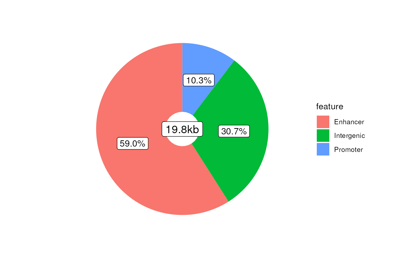
Add a hole in the middle to turn the plot into a donut. Values between zero and 1 work best. Only implemented for pie charts using one value (i.e. fill)
Value
A ggplot2 object able to be customised with colour scales and themes.
Also note that the $data element of the returned object will contain the
data.frame used for plotting. The additional column label_radians
represents the mid-point of each pie slice and can be used for manually
adding labels to each pie.
Only applies when plotting across the x or y axes
Details
Using a data.frame as input, this function will draw pie graphs based
on one ore more columns, by simply counting the values in combination
across these columns.
One column must be selected for the fill as a bare minimum, with up to three
being possible.
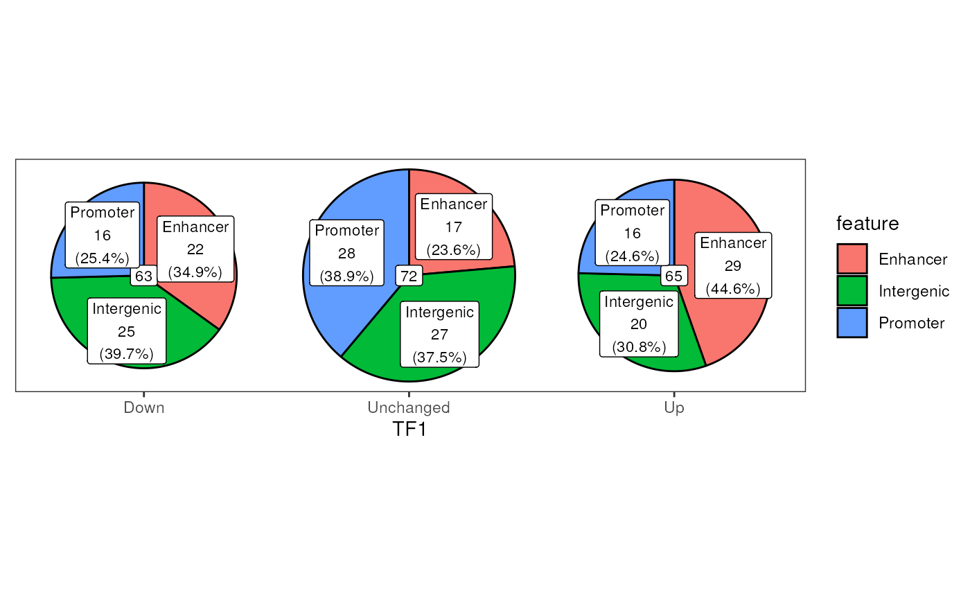
Additional columns can be set for the x-axis to draw a series of pie-graphs
in a row, with a further column able to added to layout a series of pie
graphs in a grid
If only one column/category is chosen, category labels will be added around the edge of the plot
If show_total = TRUE the overall counts for each pie graph will be added
in the centre using geom_label.
Parameters for these labels are customisable
Examples
set.seed(200)
df <- data.frame(
feature = sample(
c("Promoter", "Enhancer", "Intergenic"), 200, replace = TRUE
),
TF1 = sample(c("Up", "Down", "Unchanged"), 200, replace = TRUE),
TF2 = sample(c("Up", "Down", "Unchanged"), 200, replace = TRUE),
w = rexp(200)
)
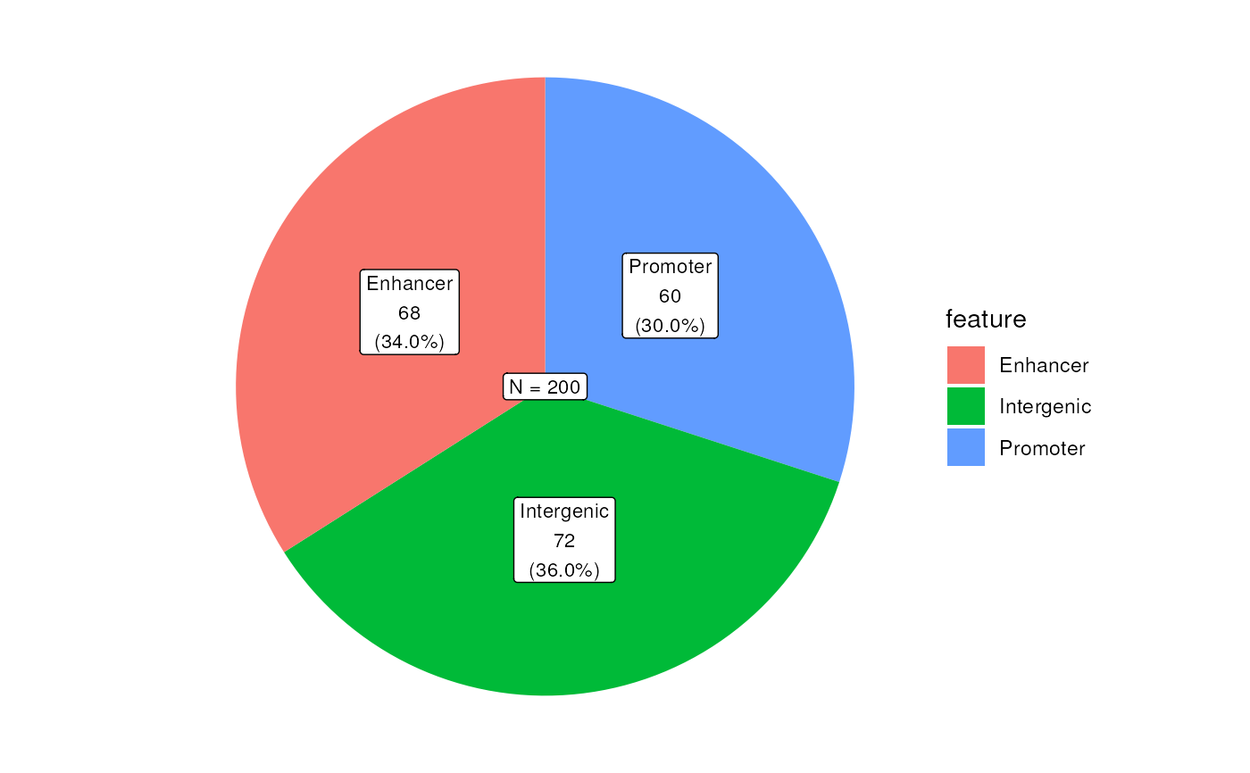
plotPie(df, fill = "feature", total_glue = "N = {comma(N)}")
 plotPie(
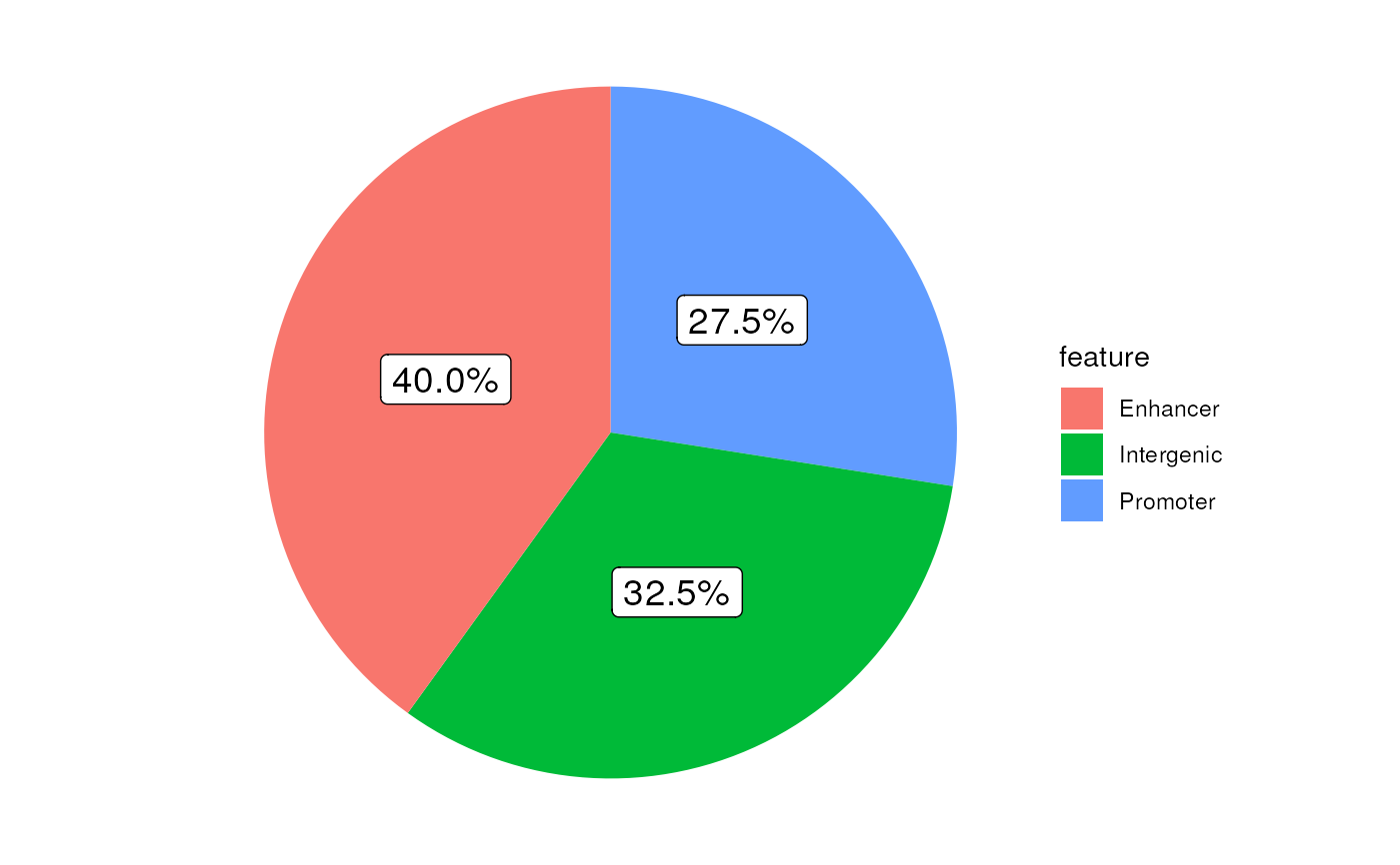
df, fill = "feature", scale_by = "w", total_geom = "none",
cat_glue = "{percent(p)}", cat_size = 5
)
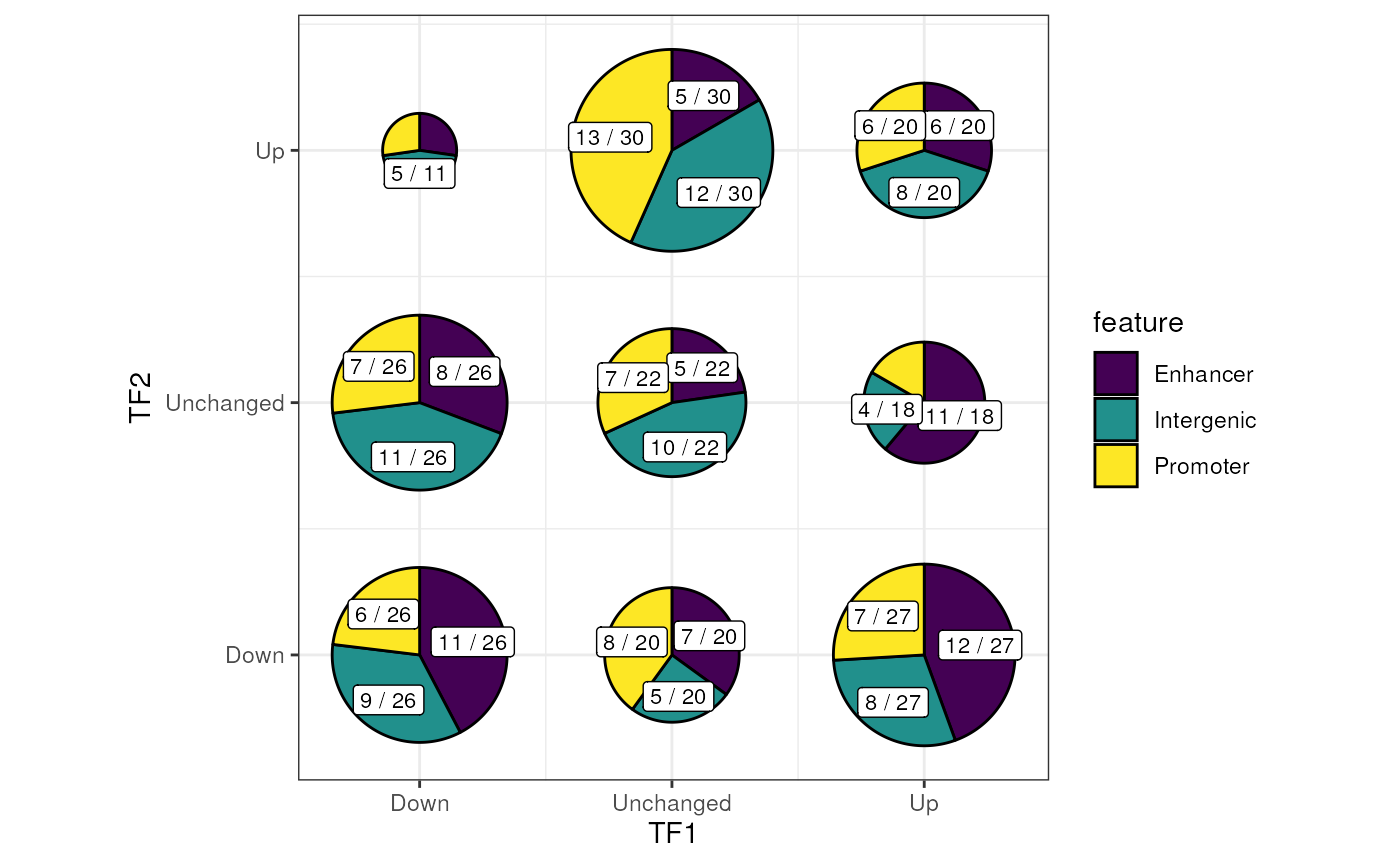
 plotPie(df, fill = "feature", x = "TF1")
 plotPie(
df, fill = "feature", x = "TF1", y = "TF2", min_p = 0.02,
total_geom = "none", cat_glue = "{n} / {N}"
) +
scale_fill_viridis_d() +
theme_bw()
 ## And using a GRanges object
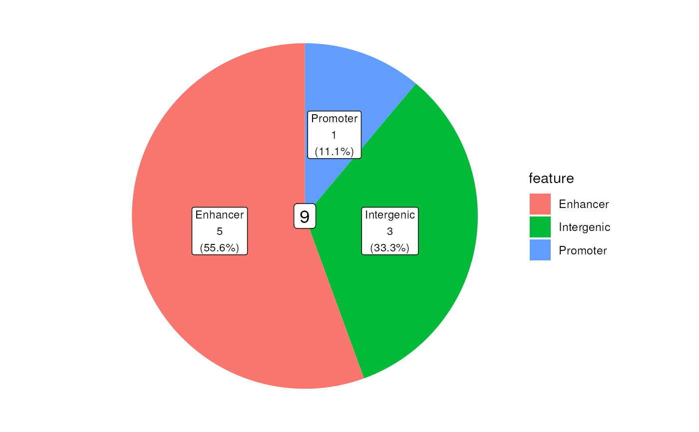
data("ex_prom")
gr <- ex_prom
mcols(gr) <- df[seq_along(gr),]
## Show values by counts
plotPie(gr, fill = "feature", total_size = 5)
 ## Show values scaled by width of each range as a donut plot
plotPie(
gr, fill = "feature", scale_by = "width", total_glue = "{round(N, 1)}kb",
cat_glue = "{percent(p, 0.1)}", cat_size = 4, total_size = 5, hole_width = 0.2
)
