Draw a plot from a GRangesList column using ggplot2
plotGrlCol(
  x,
  var = "width",
  geom = c("boxplot", "violin", "point", "jitter"),
  .id = "sample",
  df,
  fill,
  colour,
  q = 0.1,
  q_size = 3.5,
  qline_type = 2,
  qline_col = "blue",
  total = "{comma(n)}",
  total_geom = c("label", "text", "none"),
  total_pos = c("median", "top", "bottom"),
  total_size = 3.5,
  total_alpha = 1,
  total_adj = 0.025,
  ...,
  digits = 0
)
Arguments
- x
A GRangesList
- var
The variable to plot. Either a column in the mcols element or width. Can be quoted or unquoted
- geom
Choose between different geoms, or even provide a geom_*() function
- .id
The column name to place the element names. Passed internally to the same argument in bind_rows
- df
Optional data.frame with columns to be passed to the colour or fill parameters. Must contain a column with the same name as the value passed to the
.idargument.- fill, colour
Optional column names found in the df. Can be quoted or unquoted
- q
The overall percentile to be drawn as a labelled, horizontal line. Set q = 0 to hide this line
- q_size
Text size of percentile label
- qline_type, qline_col
Linetype and colour arguments for the horizontal line showing the specified percentile(s)
- total
Glue syntax for totals, representing the length of each GRangesList element
- total_geom
Passed to annotate. Set to
noneto hide totals- total_pos
Position for placing totals
- total_size, total_alpha
Size and transparency of totals
- total_adj
Adjustment for labels
- ...
Passed to the geom if selecting via character string. Ignored otherwise
- digits
Number of decimal places for the horizontal line label
Value
A ggplot object
Details
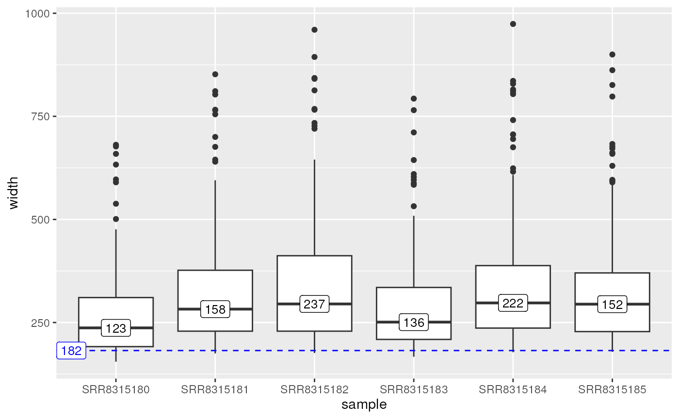
Using a common column or the width of the ranges, produces a boxplot or
violinplot from each element of the provided GRangesList.
The names of the GRangesList will be passed to the x-axis using the .id
argument.
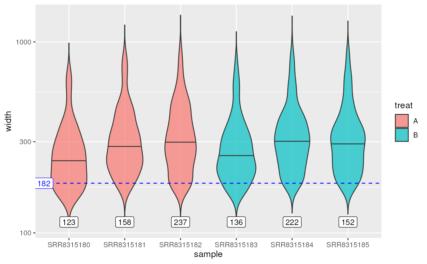
A data frame containing annotations corresponding to each element can be
supplied, ensuring that the column associated with each elements is the name
passed to the .id argument.
If q is > 0, a horizontal line will be draw corresponding to this percentile across the complete dataset, with parameters for this line able to be set using the qline_* arguments. The digits argument controls how many decimal points will be shown for the associated label.
The total length of each element will be added by default as a total, and is able to be placed across the median values, or at the top and bottom extremes of the plot.
Examples
## Load some peaks
data('peaks')
names(peaks) <- gsub("_peaks.+", "", names(peaks))

## The default boxplot
plotGrlCol(peaks)


## A customised violin plot
df <- data.frame(sample = names(peaks), treat = rep(c("A", "B"), each = 3))
plotGrlCol(
  peaks, geom = "violin", total_pos = "bottom", total_adj = 0.05,
  df = df, fill = "treat",
  draw_quantiles = 0.5, trim = FALSE, width = 0.7, alpha = 0.7
) +
scale_y_log10()


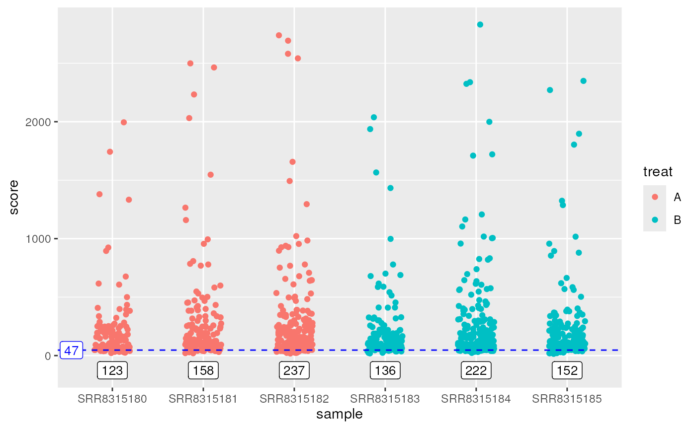
plotGrlCol(
  peaks, var = score, geom = "jitter", total_pos = "bottom", total_adj = 0.05,
  df = df, colour = treat, width = 0.2, height = 0
)


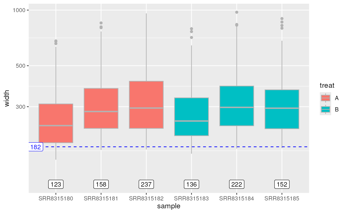
plotGrlCol(
  peaks, geom = geom_boxplot(colour = "grey70"), df = df, fill = treat,
  total_pos = "bottom", total_adj = 0.05,
) +
scale_y_log10()
