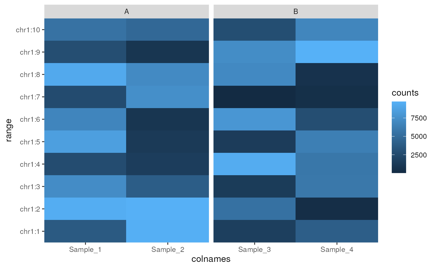
Draw a heatmap from a single SummarizedExperiment assay
Source:R/plotAssayHeatmap.R
plotAssayHeatmap-methods.RdUse ggplot2 to create a heatmap from a SummarizedExperiment object
plotAssayHeatmap(x, ...)

# S4 method for class 'SummarizedExperiment'
plotAssayHeatmap(
  x,
  assay = "counts",
  by_x = "colnames",
  facet_x = NULL,
  ysideline = FALSE,
  yside_col = NULL,
  trans = NULL,
  n_max = 100,
  ...
)
Arguments
- x
a SummarizedExperiment object
- ...
Not used
- assay
the assay to take values from
- by_x
the parameter to use for the x-axis. Will default to column names but should be one value per sample, such as an additional column containing shortened sample labels.
- facet_x
column from colData(x) which will be used to group samples along the x-axis
- ysideline
logical(1) Draw a line across the side of the y-axis summarising values for each range
- yside_col
column from colData(x) to group and colour the lines drawn on the side of the y-axis. If grouping by treatment or replicate, the mean values will be shown
- trans
character(1). Any transformative function to be applied to the data before calculating the density, e.g.
trans = "log2"- n_max
Maximum number of ranges to draw
Value
A ggplot2 object. Scales and labels can be added using conventional
ggplot2 syntax.
Details
Draw a heatmap containing selected values from an assay within a SummarizedExperiment object. Columns within the colData element of the object can be used to facet along the x-axis (e.g. treatment groups). The maximum number of points is set to be 100, although this can be changed easily should the plot require more ranges to be drawn.
The averages across any grouping of samples can be drawn as a line plot on
the side of the y-axis by setting ysideline = TRUE, with groups as
specified in yside_col. This feature is added for the specific context of
neighbouring or overlapping ranges, and as such may be less informative in
any other scenario
The returned object is a ggplot2 object so scales can easily be added after heatmap creation using scale_fill_\* for the main heatmap, and scale_colour_\* for any groupings along the y-axis
Examples
nrows <- 10; ncols <- 4
counts <- matrix(runif(nrows * ncols, 1, 1e4), nrows)
colnames(counts) <- paste0("Sample_", seq_len(ncols))
df <- DataFrame(treat = c("A", "A", "B", "B"))
se <- SummarizedExperiment(
  assays = SimpleList(counts = counts),
  colData = df
)
rowRanges(se) <- GRanges(paste0("chr1:", seq_len(nrows)))
plotAssayHeatmap(se, facet_x = "treat")
